Designing Confirmation
Best practices and the future of confirmed action

The confirmation design pattern isn’t something to be taken lightly. If employed erroneously, or not at all, users may commit unintended havoc. This article shares guidelines and best practices for designing effective confirmations.
Confirmations ask a user to verify whether they want to proceed or cancel a requested action. Confirmations are often used for destructive actions, like deleting a photo album, or consequential actions, like publishing this article.

Confirmations aren’t always needed, and can actually increase mistakes. If a user is bombarded with confirmation for every action, they will disregard it. Confirmations shouldn’t be used for actions that are easily reversed or inconsequential.
Good practice:
- Present the action as a question in the header
2. Explain the outcome of the action in the body
3. Restate the action in the confirmation button

Avoid:
- Ambiguous questions like “Are you sure?”
- Non-descriptive body copy
- Yes/No actions
- “Cancel” can cause confusion. When committing a destructive action, like discarding changes, users may mistake “cancel” for the intended action instead of canceling the confirmation dialog.
Confirmations can include multiple interactions to make the outcome explicit to the user. Examples include checking boxes that indicate the intention or entering a password.

Confirmations can be presented in a number of ways including inline, modal, and tool-tip. Feel free to download the sketch file below and use these designs in your next project.

The future of confirmed action

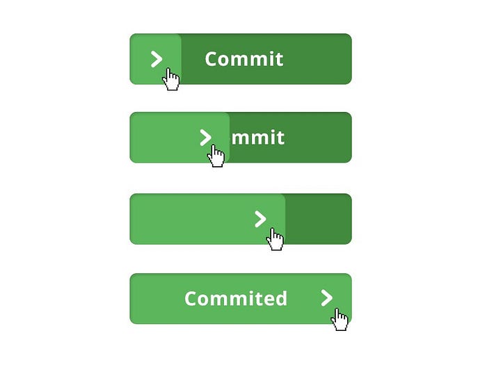
In 2014, I wrote an article on building a better button. It was in response to the “Flat Design” trend. Buttons were looking less like buttons, and I worried that users would unintentionally invoke harmful actions. The idea was to create a button that required a more intensive interaction than a click or tap.
Now, we are on the verge of 2017. Virtual reality, augmented reality, wearables, and gesture/voice-based interfaces of all kinds are going mainstream. We are moving to a future where the dexterity and context of an interaction is vastly different. Easier. Does this change the way we think about invoking action?
How do you think confirmations will change? What new best practices will emerge?
Want to build better UI?
Get the free design system I’m building.
