Design Better Cards

Summary: The card component is a preview of more detailed content a user sees when actioned. Elements include multimedia, text, links, graphs, and captions.
The card is a user interface component that acts as an entry point to more detailed information. Varying sources of information are pooled together and presented in a digestible way.
The proliferation of varying screen dimensions and the launch of HTML5/CSS3 around the turn of the decade enabled the card to take shape. It was the perfect representative of the new web, where social media sites like Facebook, Twitter, and Pinterest launched into the mainstream. The web saw greater personalization, aggregation, and socialization than ever before. The card was its container.
The Card’s Shape
Cards present various content pieces in a group. The viewer attains a quick overview of information and has the option to see its entirety.
The information between cards is of equal hierarchy. Users evaluate each card before committing to action.
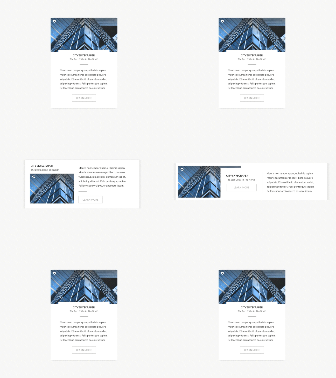
Cards work well for responsive web design because of their flexibility. Media queries allow the reordering of content to fit any screen. This malleability unifies a visual language and user experience across devise types.
Deconstructing the Card
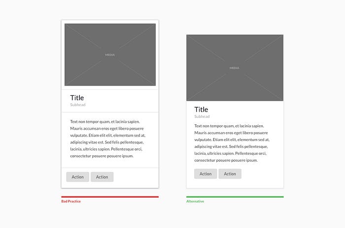
To design better cards, you must understand its comprising elements. Cards may include a headline, sub-headline, summary text, multi-media, image, video, graph, comments, and action. Actions are usually limited, and in many cases, the entire card serves as a singular link.

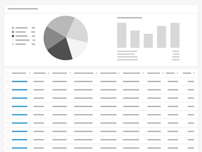
Cards are presented in many ways, including individually, in a timeline, gallery, next to each other, or making up a dashboard.
Card Design Best Practices



It takes hours of research and attention to create content like this article. Please give it a few claps to motivate me to keep writing. It’s free for you but means a lot to me.
Want to build better UI?
Get the free design system I’m building.

