Design better accordions
Learn accordion UX/UI design best practices
Accordions encapsulate content that’s revealed when clicked through an expand and collapse interaction. They are used in FAQs, product information, forms, navigation, and tables. They are best used when the user only needs a few key pieces of content on a page. Keep in mind that the use case and the user should dictate your UI choices.
I published the design file I used to create the examples in this article to the Figma Community.
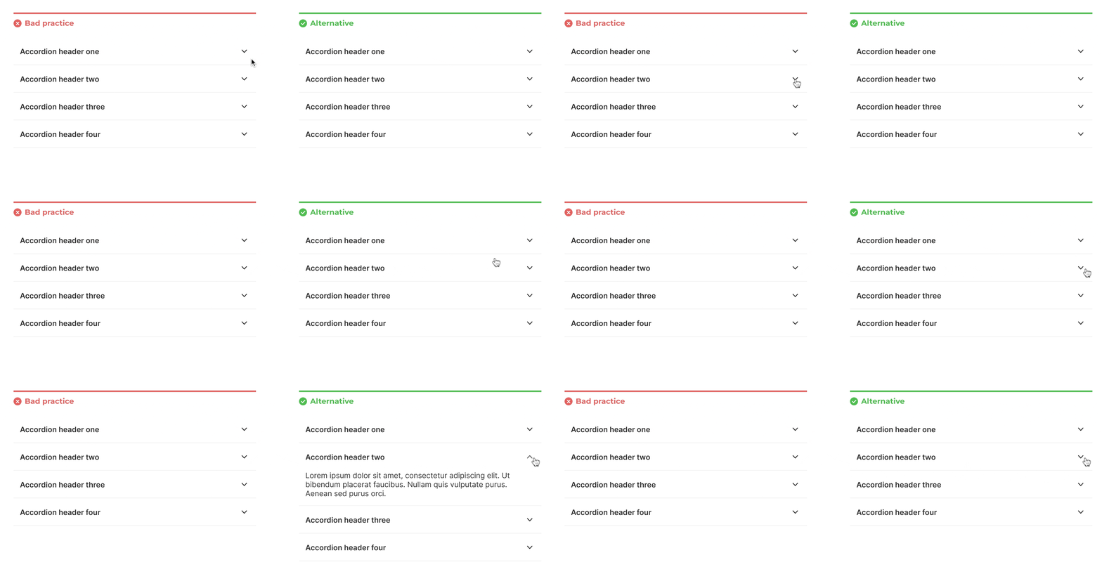
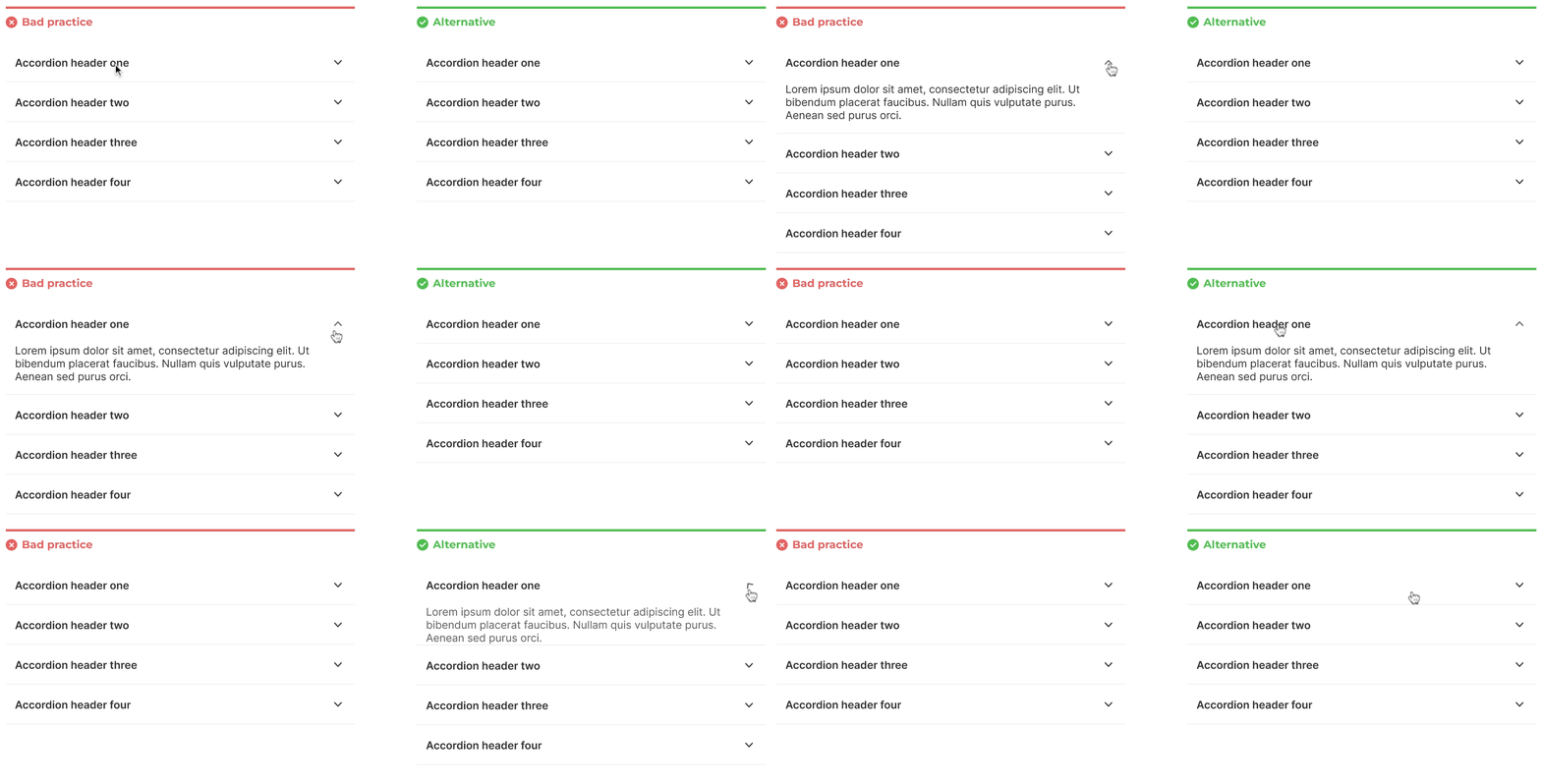
Include an opening and closing animation

When the user interacts with an accordion, there should be a subtle animation so users understand what happened and they don’t lose their place in the user interface.
Allow users to expand multiple sections

Expanded items should stay open until the user closes it. Expanding additional items shouldn’t close previously expanded items. Don’t automatically close items when a new one is expanded.
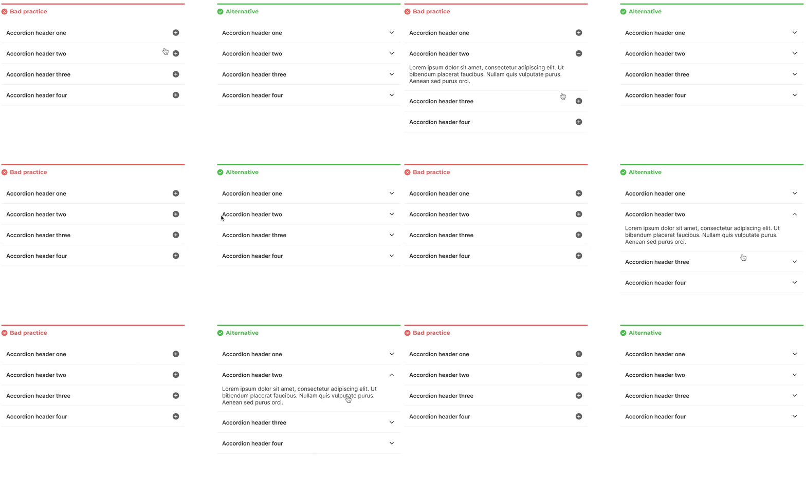
Use a caret icon

Using an icon to indicate the interaction helps the user understand what to expect. Studies have shown that a caret icon is a good choice for accordions.
The caret direction shows what will occur when the item is clicked. Use a downward-facing caret icon to afford the expand interaction and an upward-facing caret icon to indicate the collapse interaction. A right-facing caret icon can be confused for a link to another page and a plus icon can be confused for a creation interaction.
Clicking the entire header section (including the icon) should expand the menu

Make sure the entire area that the header text and icon is in is clickable to expand the item. Making just the header or the icon clickable decreases the likelihood of a successful interaction.
Use indentation when there are multiple trees

Children and grandchildren sections should be indented so the user understands the hierarchy of the presented information.
Accordions need to be accessible by tap, click, keyboard, etc.

Accordions introduce greater complexity for accessibility. Accordions should be keyboard navigable and screen-reader friendly. They need to be operated by clicking (mouse, trackpad), touch (mobile), and keyboard (screen readers), etc.
If users need to read all the content on the page, accordions might not be the best option
Showing all the content of a page without the need to open an accordion is often a better approach even if it makes the page much longer. Scrolling is usually a less costly interaction than clicking, especially on a desktop.
Accordions are used when space is limited but they can be overlooked. The extra interaction they require to show additional information is often more cognitive load on the user than scrolling, therefore, accordions should be used sparingly.
I aim to design, code, and write about UI components and patterns for enterprise SaaS. I’m creating a product that allows software designers and engineers to plug into a comprehensive set of UI components to build amazing interfaces. Stay tuned!
If you’re interested, sign up to stay informed on my progress.
